Published
A critical aspect of accessibility is color contrast, which ensures that text and interface elements are distinguishable from their backgrounds.
In this post, we’ll explore why color contrast matters, explain the AA vs AAA standards, and show you how to test and improve your site’s contrast—including how A11y Pulse can make the process effortless.
Why Color Contrast Matters
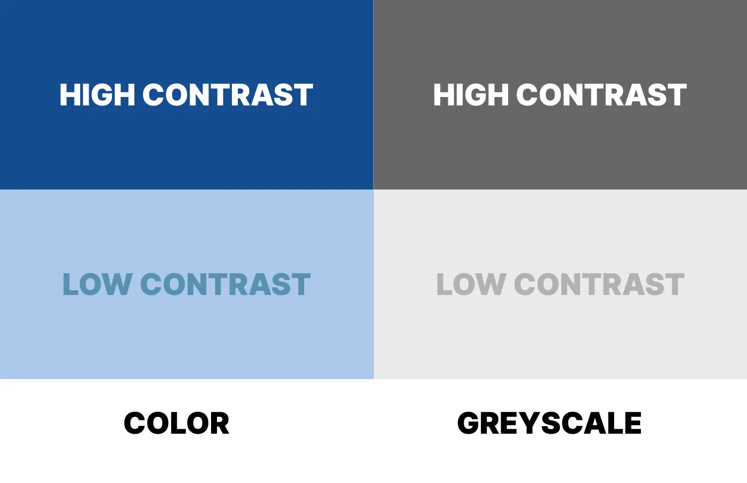
For people with visual impairments—such as low vision or color blindness—poor color contrast can make content unreadable. Imagine trying to read light gray text on a white background—it’s frustrating for anyone with reduced visual acuity.
High contrast ensures that your content is perceivable and readable, improving usability for a broader audience and helping you meet legal accessibility requirements.
WCAG Color Contrast Standards: AA vs AAA
The Web Content Accessibility Guidelines (WCAG) define two main levels of color contrast compliance: AA and AAA.
AA (Minimum Level)
- Normal text: Minimum contrast ratio of 4.5:1
- Large text (18pt or 14pt bold): Minimum contrast ratio of 3:1
- UI components and graphical objects: Minimum contrast ratio of 3:1
AA is considered the baseline standard for accessibility. Meeting AA ensures that most users with visual impairments can read and interact with your content.
AAA (Enhanced Level)
- Normal text: Minimum contrast ratio of 7:1
- Large text: Minimum contrast ratio of 4.5:1
- UI components: No specific AAA requirement, but higher contrast is always better
AAA is the enhanced standard, harder to achieve across all content but providing maximum readability for users with significant visual impairments. Many designers aim for AA compliance as a baseline, using AAA selectively for critical content like navigation or calls to action.
Text vs UI Elements
It’s important to note that text and UI elements are measured differently:
- Text: Must meet contrast ratios according to size and compliance level (AA vs AAA).
- UI elements: Buttons, icons, and other interactive components are treated like graphics. AA requires 3:1 contrast for these, while AAA encourages higher contrast for better usability. Please note that a button’s text still has to meet the text color contrast requirements, it’s the buttons background or frame that is considered the UI element.
Ensuring both text and UI components meet their respective standards creates a more inclusive experience for all users.
Free Tools to Check Color Contrast
Here are some excellent free tools for testing color contrast as you design:
- WebAIM Contrast Checker – Enter foreground and background colors to check compliance with WCAG AA and AAA.
- Contrast Ratio by Lea Verou – A simple live preview tool for testing and adjusting colors.
- Colorable – Visualizes your color palette and highlights accessibility issues.
- Tanaguru Contrast-Finder – Helps you find accessible color combinations that still fit your design palette.
These tools are great for testing individual elements, but checking an entire site manually can be time-consuming.
How A11y Pulse Helps
This is where A11y Pulse shines. Instead of checking pages one by one, A11y Pulse scans all the pages on your site and identifies where color contrast fails AA or AAA standards.
You’ll get an actionable report that shows:
- Which pages have failed color contrast tests
- Which elements are affected (e.g., buttons, text blocks, links)
- How to prioritize and fix these issues
Once identified, you can update your colors and ensure your site meets accessibility requirements—without hours of manual work.
In Summary
Color contrast is essential for accessibility. AA standards ensure minimum readability for most users, while AAA standards provide enhanced readability for those with significant visual impairments.
Free contrast checkers help for individual elements, but A11y Pulse makes it easy to monitor and maintain compliance across your entire website.
Prioritizing color contrast isn’t just about compliance—it’s about creating a web experience that everyone can enjoy.
If you're not already an A11y Pulse user, sign up for a free trial and see how easy it is to bring continuous accessibility testing into your team's workflow.
Questions? We would love to hear from you. Drop us a line at [email protected].