Accessibility reports that put your numbers in context

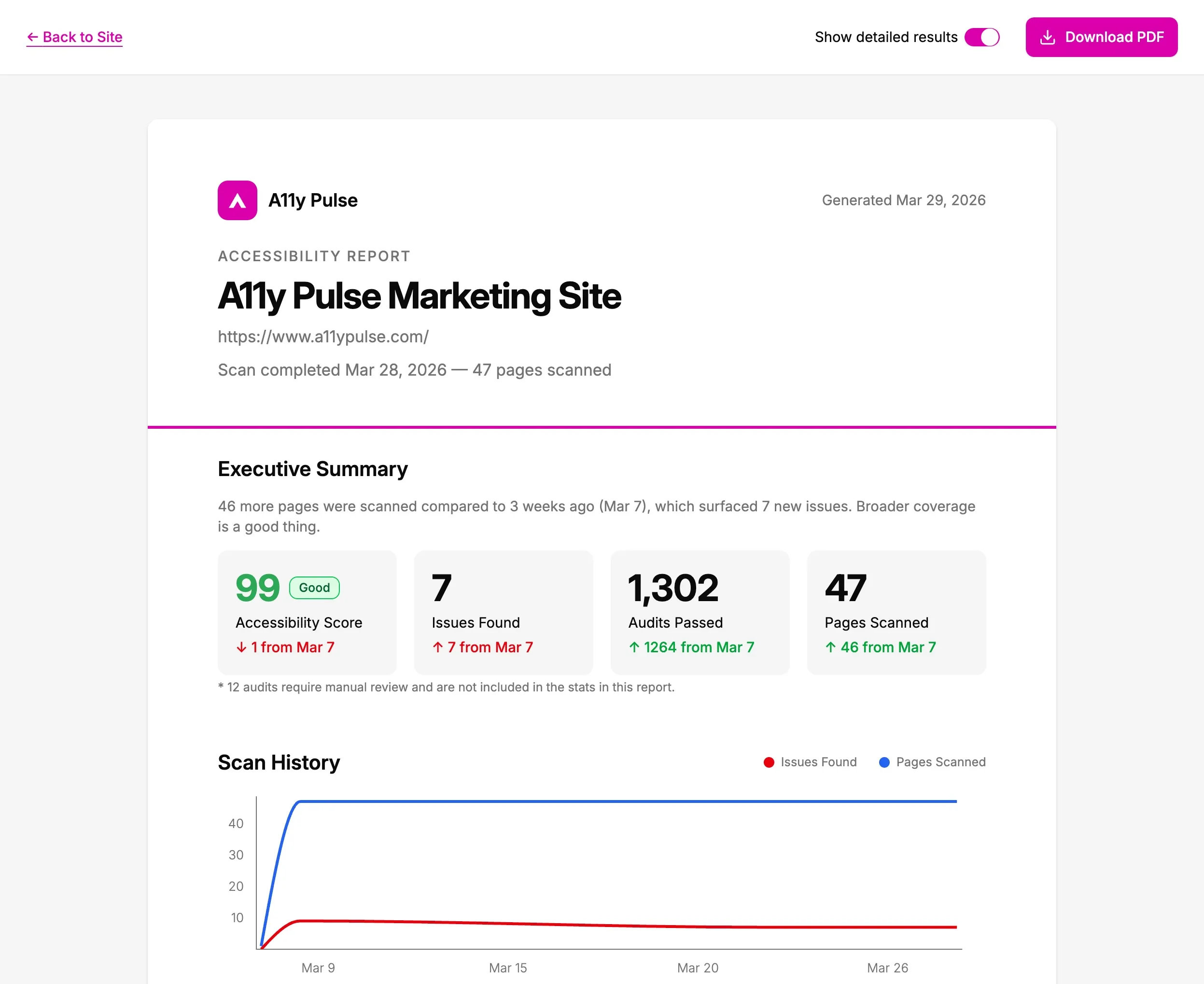
If you keep an eye on accessibility where you work, you’ve probably been asked “so how are we doing on accessibility?” by someone more senior, and it’s a surprisingly hard question to answer well. The dashboard you live in isn’t something you can hand over, and a single number out of context can mislead: an issue count that’s gone up looks like a step backwards, even when the real reason is you started scanning twice as many pages. So you can now turn any completed scan into a tidy report and pass it straight up the chain.
The high-level numbers, presented so everyone understands
Every report opens with a sentence that says what’s actually going on, and it’s the part I’m most pleased with. Rather than leave a reader to work out what the figures mean, it puts them in context, something like “You’ve resolved 3 issues compared to 7 days ago, even while scanning 5 more pages. Good progress.”
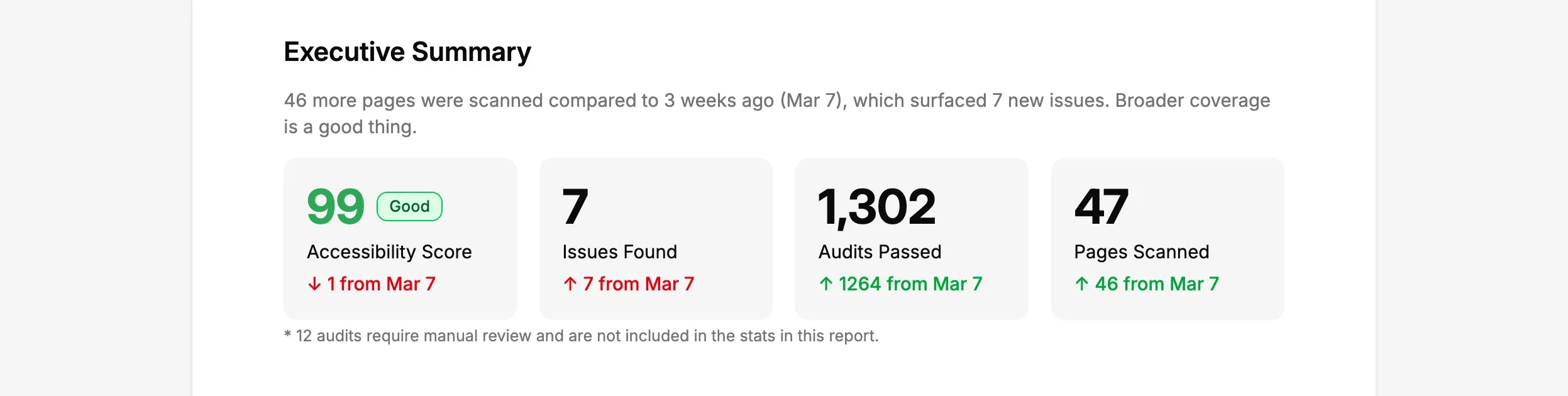
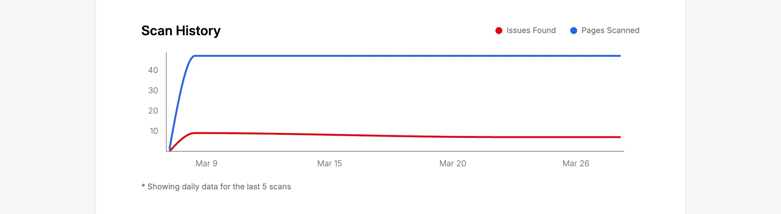
Below it sit the headline numbers, score, issues, passes and pages scanned, each with the change since about a month back, and a trend line so the reader sees the direction of travel rather than a single snapshot.
The report celebrates the wins, not just the issues
A scan isn’t only a list of what’s broken, so the report doesn’t read like one. Passing audits get their own section with the same weight as the failures, green ticks and all, “28 audits passed, 1,302 passes across your pages”. I figure that balance matters: if leadership only ever see a wall of red, accessibility looks like a bottomless pit rather than something you’re steadily getting on top of.
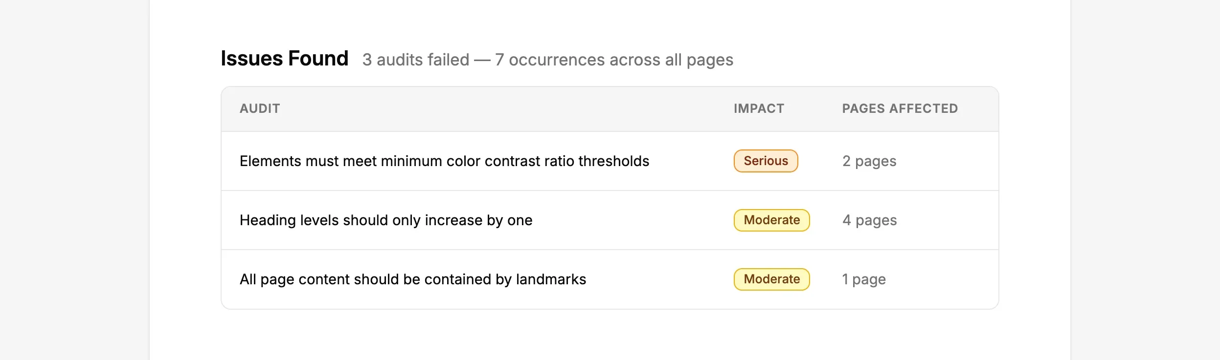
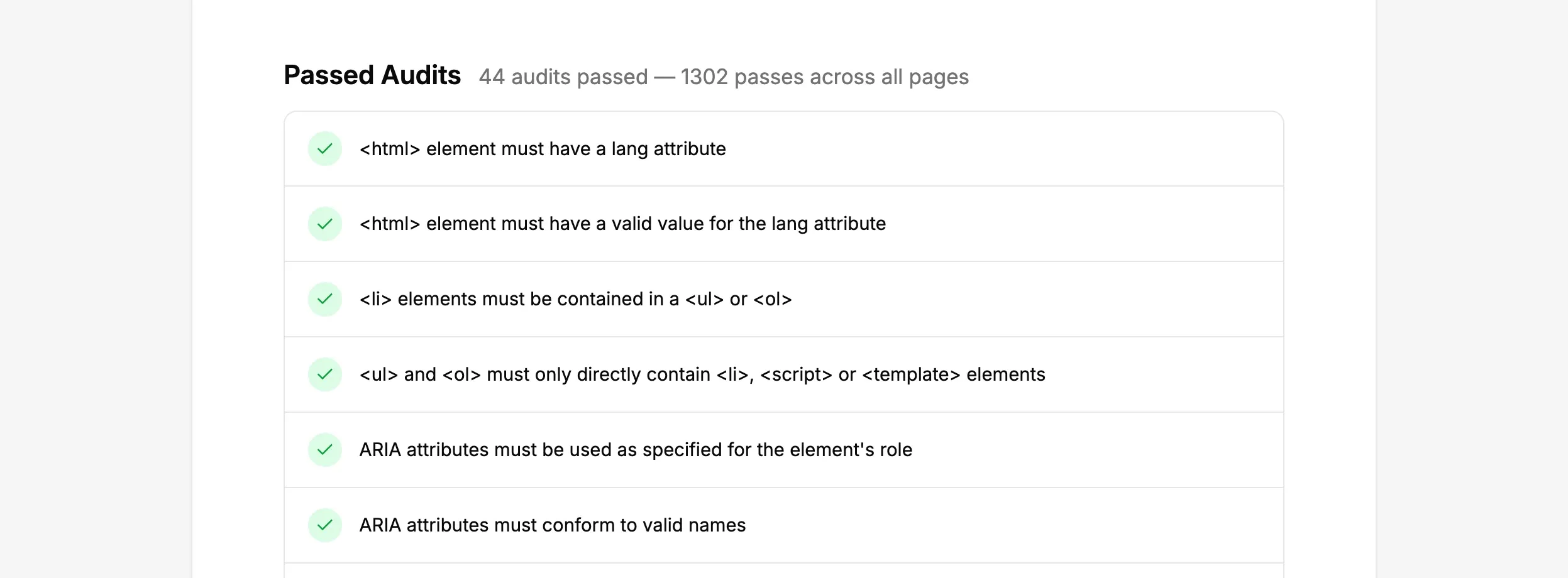
Need more detail? Flip on “Show detailed results” before you generate and the report adds an appendix with a per-audit breakdown and the affected pages. Leave it off for the tidy version that suits a board pack.
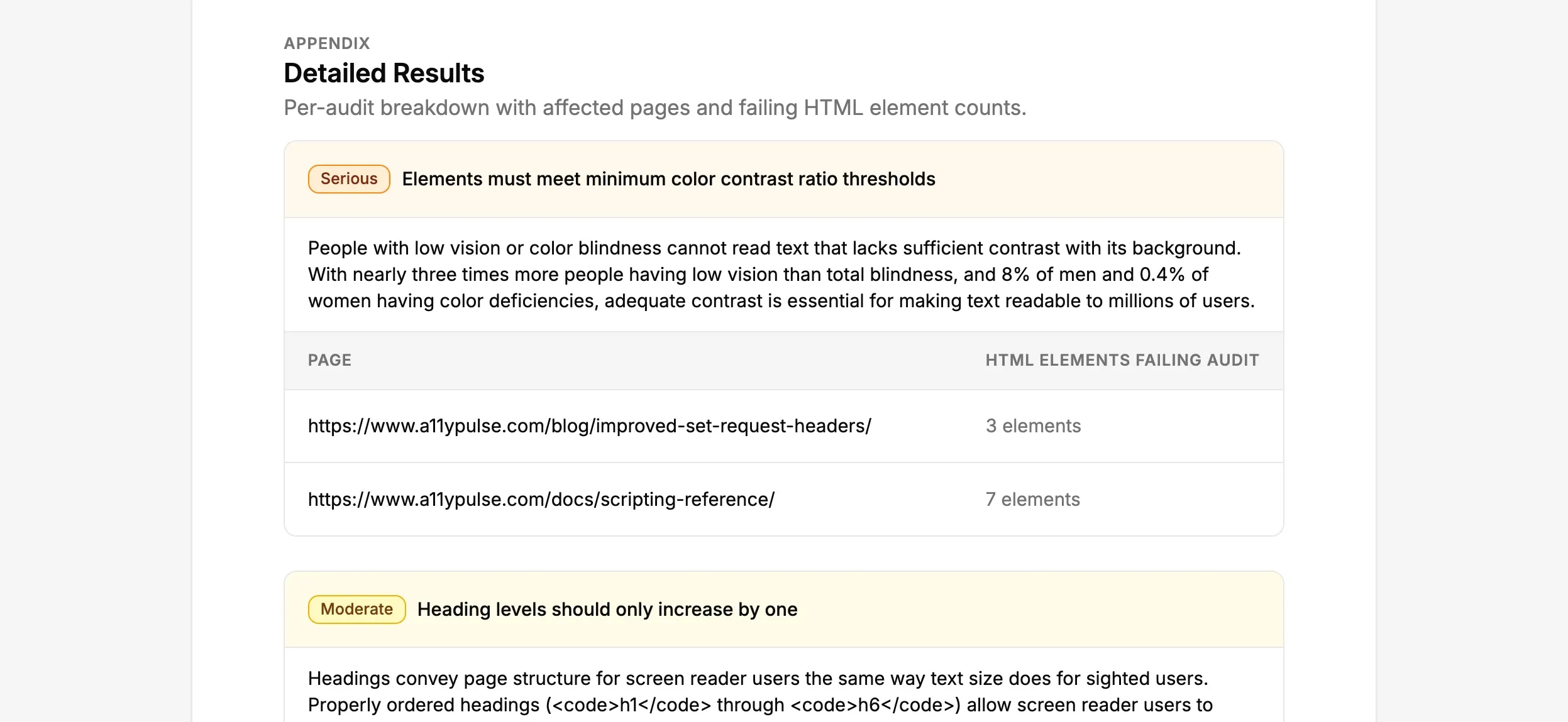
Available now
It’s live today on every plan. From any scan, or your site dashboard, hit Download PDF Report, preview the whole thing in your browser, and the PDF is one click from there. The full rundown is in our docs if you want it.
This one came straight from a customer who’d been asked by their senior team for an accessibility update and realised they had nothing to send. We’re a small team, mostly Joseph and me, so a nudge like that is usually all it takes. If you give it a go, I’d love to know whether it makes that “how are we doing” conversation any easier.
Not using A11y Pulse yet? You can start at a11ypulse.com, reports are on every plan. Running audits for clients? You can white-label these reports with your own branding too. Any questions, give us a shout at [email protected].