A focus indicator is the visible change, usually an outline or a shadow, that appears on an interactive element when it receives keyboard focus. WCAG 2.4.7 Focus Visible requires that keyboard users can always see which element is focused. Our focus appearance audit checks for this automatically on every scan.
How the audit works
The audit drives the page the way a keyboard user would. After the page has loaded, it presses the Tab key to move focus from one interactive element to the next. For each focused element it decides whether focusing it produced a visible change.
It makes that decision in two stages. First it compares the element’s focus-relevant computed styles before and after focus. These are styles like outline, box-shadow, border, and background. If any of those styles change, the audit gives that element a pass result. This stage is fast and covers the majority of real-world focus styles.
When the computed styles do not change, the audit falls back to a visual check. It takes a screenshot of the element before and after focus, and compares the two images. This catches indicators drawn with pseudo-elements or background images that a style comparison alone would miss.
If no visible change is detected, the audit gives that element a fail result.
Reading the results
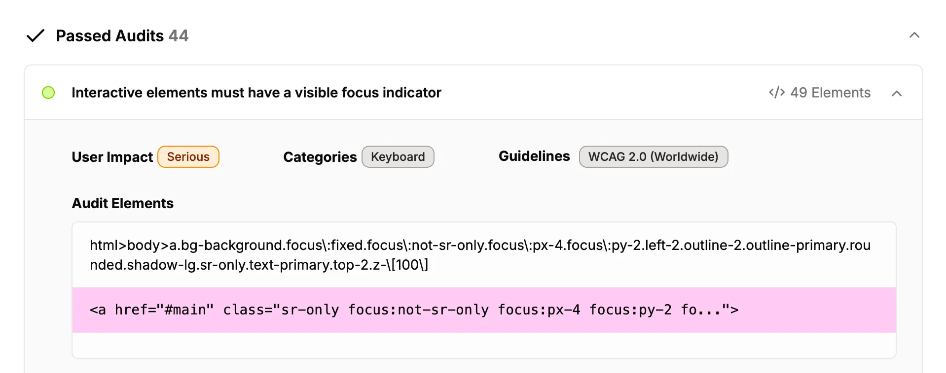
The audit reports both passing and failing results. Both sets of results contain information about the elements that were tested, including a unique CSS selector and a sample of the element’s HTML.
You can ignore individual elements you have reviewed and accepted using the same ignore feature you use for other issues.
Limitations
The audit is a heuristic. It reaches the right answer for the overwhelming majority of focus styles, but it can be wrong in both directions, so it is best used to complement manual testing rather than replace it. A few cases are worth knowing about.
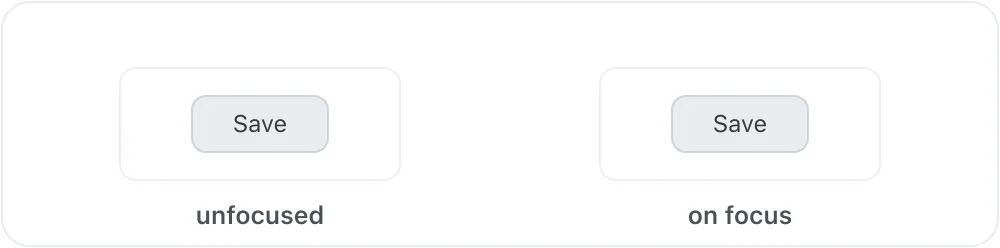
A focus style with no contrast
The audit treats any change to an element’s focus-relevant styles as a pass. If a focus style is added but has no contrast against what is behind it, the audit reports a pass even though nothing is actually visible. The buttons below are an example: the focused one has a white outline drawn on a white background.
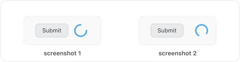
Continuously animating content
When the styles do not change and the audit falls back to comparing screenshots, it captures a small area around the element. If something nearby is animating, such as a loading spinner or blinking text, the two screenshots differ for reasons unrelated to focus, and the audit can report a pass even though focusing the element changed nothing.
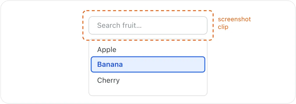
An indicator shown elsewhere on the page
Some controls show focus on a different element than the one that technically holds it. A combobox, for example, can keep focus on its text input while highlighting the active option in the list below. The audit looks at the focused element and the area immediately around it, so an indicator drawn further away can be missed and the element reported as a fail.
Other cases
The audit relies on the browser tab keeping focus while it runs, so a page that programmatically moves focus away can cut the check short. An indicator that is both drawn in a way the style comparison does not recognise and shown only under the browser’s keyboard-focus heuristic may also be missed. These cases are uncommon, and the faster style comparison handles the large majority of focus styles before the screenshot comparison is ever needed.